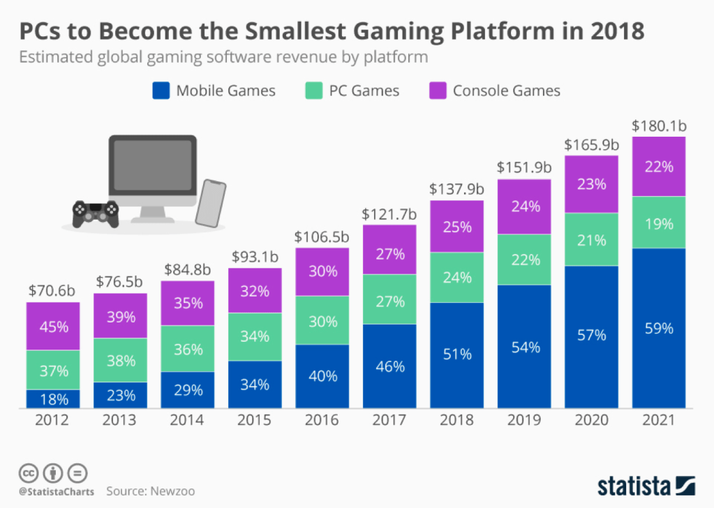
This week’s #Makeover Monday looks at trends in gaming platforms — it’s estimated that 2.3 billion global gamers will purchase $138 billion on games this year. Although PC, console, and mobile games have increased in revenue, mobile games are surpassing both in market share. More information on the data provided is here. The original visualization is shown below.
What works and what doesn’t work with this chart?
- The bar chart clearly shows the increase in revenue across all gaming platforms and the color shows the increase of mobile games across time. I like this visualization and think it communicates the message clearly. One thing that could improve is that there’s a lot of numbers on the viz — the percentages and dollar amounts clutter the entire visualization.
How can you make it better?
- Simplification would help the visualization be even more clear and feel less cluttered. Fewer labels (i.e. percentages and dollar values) would create a simpler view. The rise in mobile gaming is most interesting to me, I think a focus on that piece of information would be interesting.
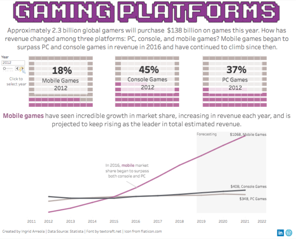
The first visualization I created included three waffle charts – showing the percentage of market share among the three platforms – and included a line chart. Rather than put everything on one chart I switched it to two views. The waffle chart includes a cursor for a person to click and see the market share shift. The line chart also focuses on mobile games and provides more context for that platform. The visualization is shown below.
I enjoyed watching the demos this week, it’s fun to watch a visualization re-created live on the webinar. A few of the learnings from the review this week included:
- Hashtags can now be used on Tableau Public, in the details section of the viz you can now include #MakeoverMonday and search for hashtags.
- Peers created really great examples of dual axis (i.e. line chart and area chart – line chart and bar chart)
- This data set includes projected revenues, including data projected for 2021. This requires context and explanation in the viz. This can be done by stating this in an annotation or text, shading over the section that is the forecast, etc.
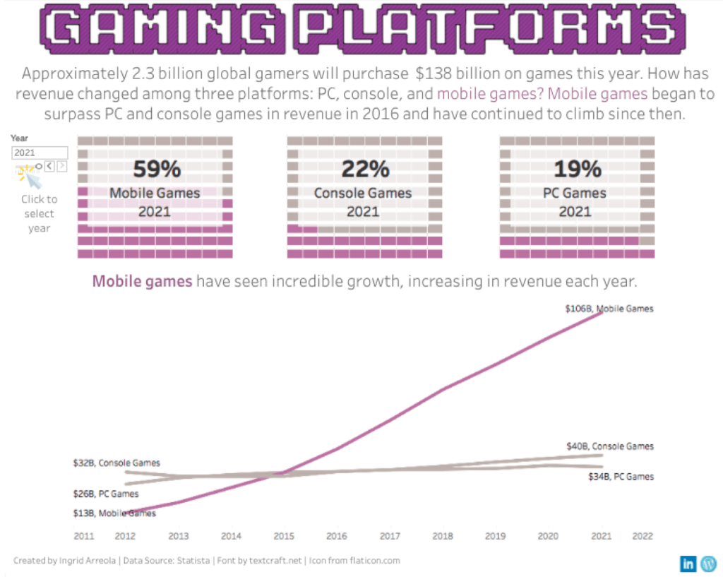
Eva and Sarah provided great feedback on other visualizations and while I didn’t receive direct feedback — I was able to iterate based off the work of other individuals who participated. My iteration included more context on the projected figures. This visualization is shown below and can be found here.