Challenge
Indiana HIMSS in coordination with FSSA, ISDH, MPH, Regenstrief Institute, and KSM Consulting conducted a data visualization and analytics challenge. This competition focused on visualizing infant mortality in Indiana to ultimately improve health outcomes for Indiana’s mothers and infants.
Process
Together with my partner, Aubrey Xiong, we focused on data storytelling to visualize infant mortality in Indiana. First, we looked at the macro view of how Indiana compares to rest of the nation and explored health trends on a state and county level. Next, we approached a granular view of data by exploring clinical data from IU Health to understand clinical factors affecting mothers and infants. Finally, we focused on social determinants of health as an additional layer of insight with a focus on policies that can serve as solutions to improve infant and maternal health in Indiana. This was an iterative process throughout the data discovery and additional details were added after receiving feedback from judges of the competition and doctors at Riley Children’s Hospital.
Research
The first step in engaging with this challenge was to research infant mortality, the importance of social determinants, and policies/resources focusing on equity. One resource that was particularly helpful was the National Birth Equity Collaborative, Dr. Joia Adele Crear-Perry was extremely helpful in providing research conducted by NBEC around health equity and infant mortality. Reading and researching helped provide context on the complexity of infant mortality, and knowledge for our data exploration.
Data Exploration
Indiana is unique because there is open collaboration and data sharing between various state agencies, such as the Department of Health, Family and Social Services Administration, Management Performance Hub, and the Regenstrief Institute. All of these institutions shared data sets and made them available for this data challenge.
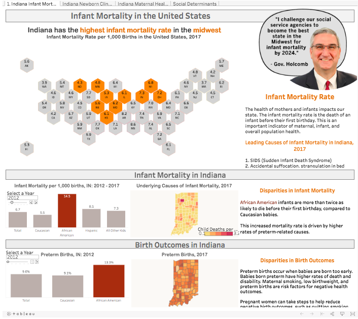
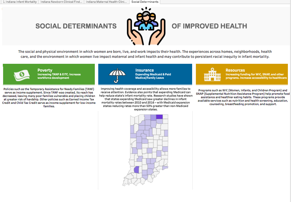
We explored this data and found a lot of great information related to health indicators – the biggest challenge here was narrowing down which data sets to use. The Dep. Of Health produces a natality and mortality report which provided statewide and country trends throughout the past few years. The CDC provides national information on infant mortality and other birth outcomes – providing the macro view of this challenge. The Census has great data tools to look at social determinants (i.e. poverty, insurance accessibility). Other social determinants we were interested in included programs available for women to help them during their pregnancy and assistance for low-income families (i.e. WIC, TANF, SNAP). An exploration of these various indicators provided the macro view, statewide and county trends, and social determinants. After browsing the various data sets we determined the general theme of social determinants of health since so much of health is deeply rooted in determinants.
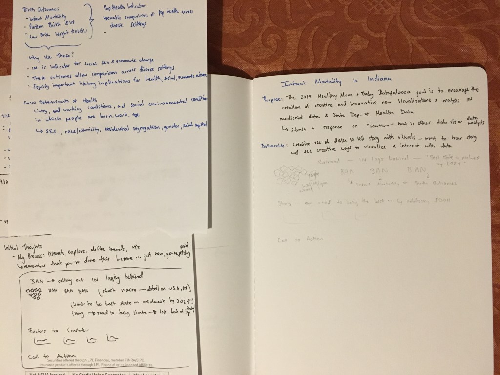
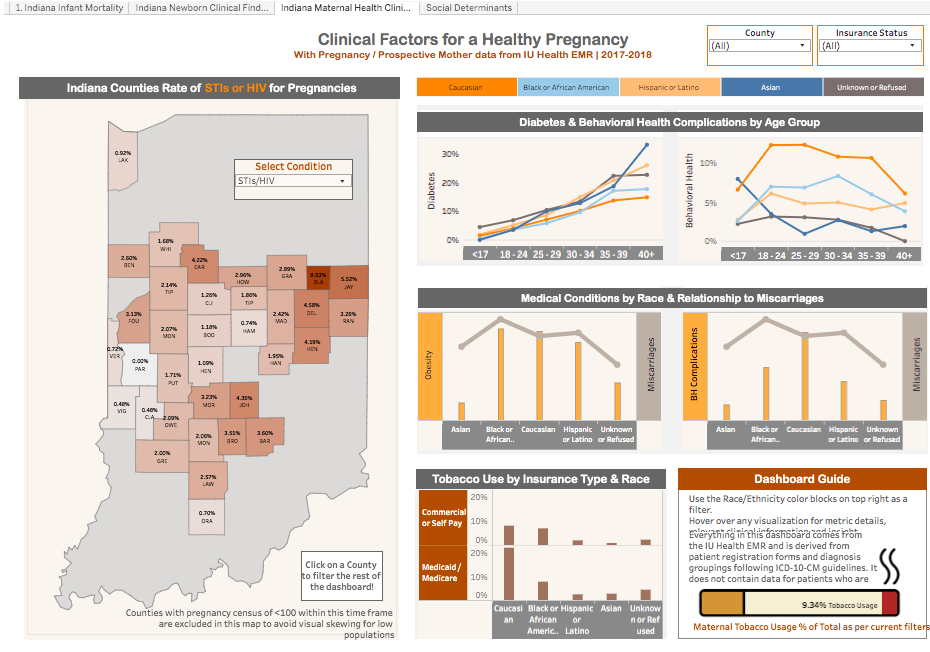
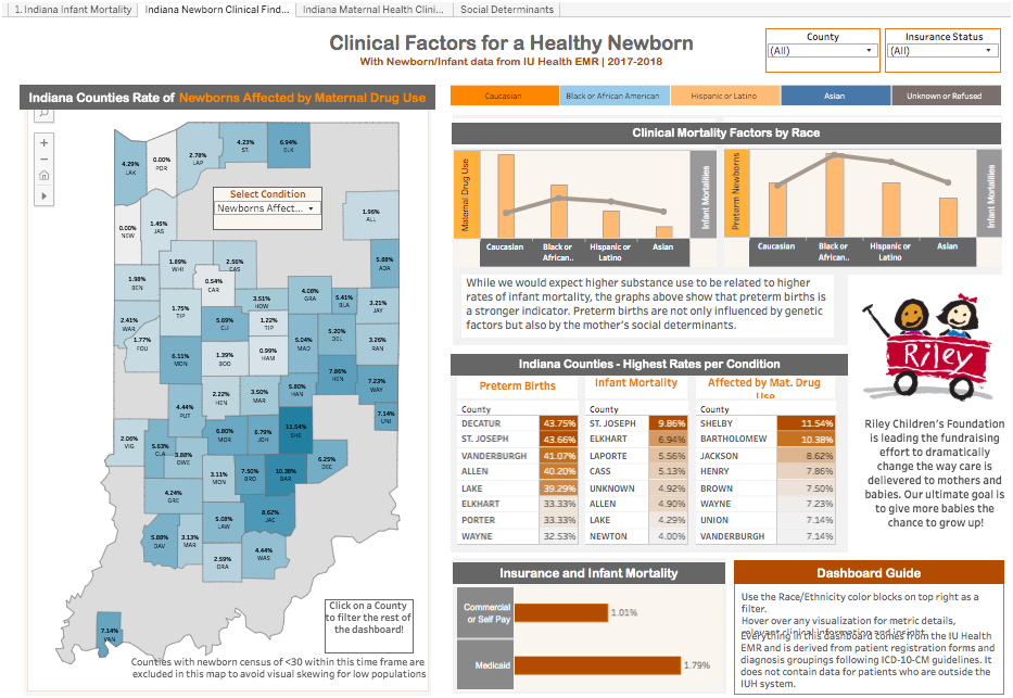
Next, Aubrey focused on data exploration within the electronic medical records of IU Health. She was gracious enough to walk me through this process – super helpful since it was my first few weeks at IUH. Relevant data from the medical records at IU Health was explored, providing a granular view and a deeper look at the trends. IU Health is the largest healthcare system in Indiana, which provided a bit of data to review and elaborate upon. Since we had no preconceptions of what medical relationships would be present – or what this would look across race/ethnicity, insurance, and location – we played around with this data prior to any visualization development. We created many flat tables and simple visualizations to explore clinical risks. We did this by picking specific categories for the risks as medical conditions tend to stem from sources both biological and environmental (i.e. diabetes, obesity, smoking, substance use, malnutrition). We explored this data, settled on a few data points, and began to design the user interface of the dashboard. User interface optimization is heavily dependent on the amount of data being presented, the intent of the message, and the target audience. We chose a simpler interactive style for the opening and concluding dashboard tabs for maximum visual stimulation and to drive our themes of social determinants and disparities by race/ethnicity. The middle two dashboard tabs is designed for our audience to dig into the data and encourages individuals to explore those differences across race/ethnicity, geography, and insurance.
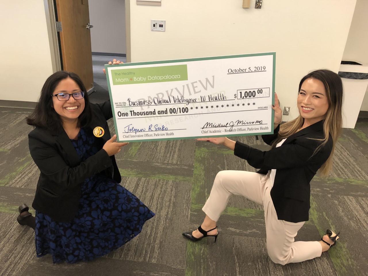
Finally, we practiced our presentation and had fun determining the key points we wanted to discuss. The final dashboard version has been uploaded to Tableau Public and is available for exploration. We had a great time at the event, where we were able to see students and professional teams present on their findings. This was really interesting because there was a mix of machine learning, data models, visualizations, and dashboards all on infant mortality. We were both blown away by the brilliant minds in the room and seeing the collaboration across our state and other states (i.e. Michigan). Aubrey and I both placed 1st among the professional teams and were humbled and excited!
Reflection
What did you learn from this project?
Aubrey: I was able to gain a deeper appreciation to certain relationships within the data in areas such as racial disparity. You know these things exist, but until you explore it in a deep way, the reality doesn’t get etched into your brain as deeply. When it comes to the actual competition part – I was impressed to see compelling, creative and technically advanced work created for this competition. This was incredibly reassuring to me that there is technological innovation happening in Indiana. And of course, it’s heartwarming to see that people care so much about the social welfare of others.
Ingrid: So much. This is the first project where I’ve had the chance to collaborate with another person on the data exploration, data visualization (Tableau), and final presentation. It’s always a lot of fun to see individuals who are knowledgeable and passionate about their craft. I learned so much from Aubrey about how the information exists in the databases, how to query so much detail, lightning fast Tableau calculations and manipulation, exemplary user interface and design. I was blown away during the competition and really enjoyed seeing the final data products that other teams developed.
What is one thing you learned about storytelling with data from this project?
Aubrey: Less is more. Concise is better than convoluted. Don’t worry about overdoing it on technical sophistication because impactful and unpretentious visualizations have their own unique merits when stacked up against data models. Make your work memorable and approachable.
Ingrid: I tend to develop just one long dashboard and pack it all in there, but I think the multiple tabs provided an extra depth of information and helped layout the story that we wanted to tell.
What did you learn from the other finalists’ presentations?
Aubrey: I always neglect creating a PowerPoint presentation for my work because I’m like “let the work speak for itself” but I guess PowerPoints are pretty standard.
Ingrid: PowerPoint presentations are ubiquitous. I liked how teams provided visible context via their presentations before diving straight into their data product. I also really enjoyed teams (i.e. Michigan) who really made it clear who their audience was, invited you to visualize yourself in specific roles (i.e. health coordinator, clinician, etc), and were overall good public speakers.
