February 17, 2019
I’m excited to begin the #Makeover Monday challenge for Week 8. This week the data set focuses on wind energy.
This data set is from the American Wind Energy Association. This is recent data from 2018 and was interesting to look at because of the comparison across the states in the U.S.
The original post is here. I enjoyed seeing how the wind turbine was used as an illustration for the size of wind energy in each state. I was also impressed with how much information was packed in one image. I liked the colors used for the graph.
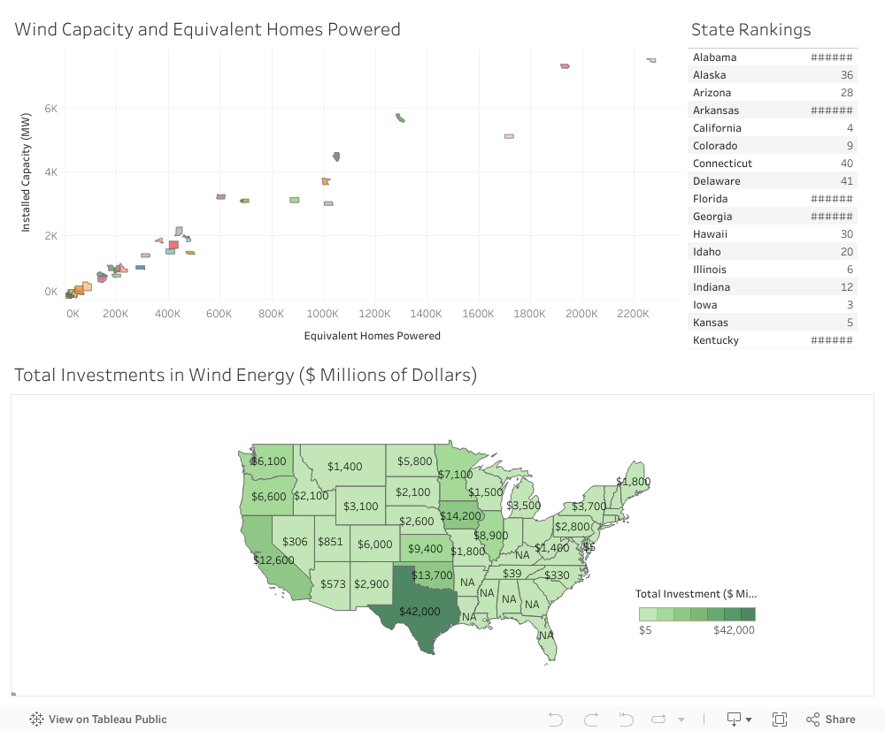
When I took a closer look at the data set I saw that there were state rankings based off the installed wind capacity. I thought that was very interesting and wanted to include that in the data visualization produced on my tableau public site. Since this is the first Makeover Monday that I’m participating in, I wanted to limit my time to one hour.
I thought it’d be interesting to have a ‘macro’ view — thus created the chloropleth map to view the investment by state. The rankings were included as well — please note that there are a few states with no data available to create a ranking. Finally there is a scatter plot looking at the wind capacity and the equivalent home being powered through that energy.
The data visualization is on my tableau public site.