Iron Quest: “a monthly community-led data visualization project…participants have a calendar month to source a suitable data set and then design, build, and submit a data visualization. Every visualization should aim to showcase best practice & skill in design, storytelling & analysis.” January’s Iron Quest Challenge was in collaboration with #ProjectHealthViz, founded by Lindsay Betzendahl, and “this project is an effort to create a resource for Tableau users in healthcare to seek out each other and share visualizations.”
Challenge: “Healthcare in Prisons.” Healthcare is a human right and it is an international law which establishes that every human being, prisoners included, have the right to receive services for their physical and mental health. Healthcare is a public health issue in prisons, and the challenge is to explore this through data.
Research: My initial step to all data related projects. There were a few resources and possible data sets to use posted on Sarah Bartlett’s blog. After looking at the CDC and other government sites I hadn’t found the data set for this challenge. Next, I turned my eye and reading towards the Prison Policy Initiative. The Prison Policy Initiative produces publications on prison and the policies that impact inmates, as well as the larger effects of mass incarceration. After exploring this website, I found a fascinating data set that examined medical co-pays in prisons. I hadn’t ever thought about medical co-pays in the context of prison, and found it very compelling after reading about this issue. The data set provided great information, the publication provided context, and the impact of state policy on inmates’ health was intriguing.
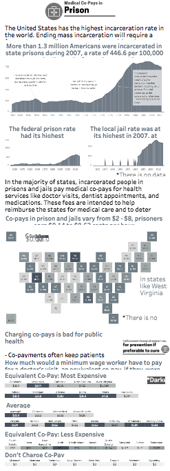
Research Findings: the majority of states charge an unaffordable fee for medical care in prison. In the majority of states, incarcerated people in prisons and jails pay medical co-pays for health services like doctor visits, dentist appointments, and medications. These fees are intended to help reimburse the states for medical care and to deter unnecessary doctor visits. Co-pays in prisons and jails vary from $2 – $5 — while incarcerated people typically earn $0.14 to $0.63 cents per hour. Eight states don’t charge co-pays or don’t have a medical co-pay policy. Alabama, Arkansas, Georgia, Texas are states that expect prisoners with no wages to pay for medical co-pays. Also, Florida, Mississippi, and South Carolina have many jobs that don’t provide pay. After looking at the data set and exploring the various layers – it became apparent that charging co-pays is bad for public health. The copayments often keep patients from seeking care, it discourages early detection and intervention which in turn can exacerbate a health issue. The consequences include sick people avoiding the doctor which makes illness more likely to spread. If people avoid being treated for illnesses, their condition will worsen.
Design: This was challenging because there was a lot to think about and certain aspects that could be deeply explored. There is mass incarceration – which could have its own separate deep dive – differences that exist in policy across the U.S., medical co-pays, and the equivalent fees that we would pay if we were charged at the same rate as prisoners. In the end I wanted to focus on the medical co-pays and create a visualization that would look at the various data elements. My visualization goes for a clean design to lead the reader from the broad picture of mass incarceration, to a macro view of the U.S. medical co-pays, to the small details of how the prices vary drastically state by state.
Data: This visualization uses data provided by the Prison Policy Initiative, a non-profit, non-partisan organization that exists to “produce cutting edge research to expose the broader harm of mass criminalization, and then spark advocacy campaigns to create a more just society.” The Prison Policy Initiative produces many publications, has public data sets, and has a wealth of information on the criminal justice system. Additional information on the source can be found here, state policy information is here.
Final Visualization: This visualization begins by looking at mass incarceration in the U.S. The sharp increase over the past 30 years is overwhelming. The following graphs reveal how state policies contribute to much of this growth. Next, medical co-pays are looked at across the U.S. Finally, there is a breakdown of the equivalent co-pays we would pay if we were charged the same price as inmates. View the final visualization on Tableau Public, here.