I recently found out about the Storytelling with Data Challenge and participated in the April challenge. The challenge this month was to emulate a visualization. I follow and read Ryan Sleeper’s blog frequently, it is extremely helpful and I highly recommend it! Ryan created a dashboard about the presentations/training he’s currently engaged in and “Where’s Ryan” caught my eye because of its simplicity.
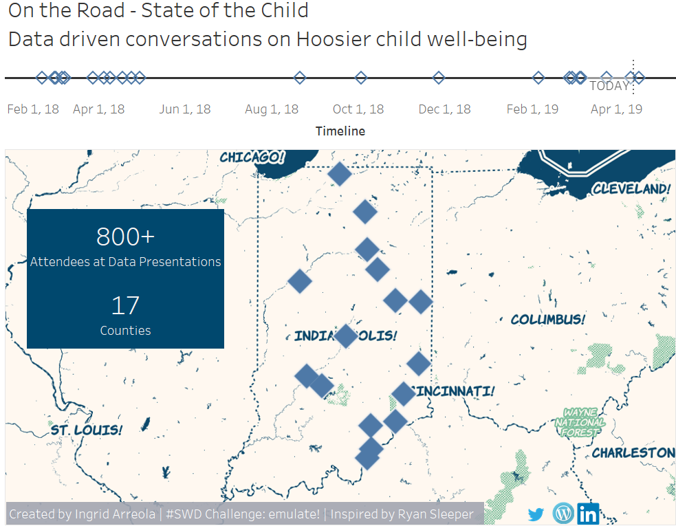
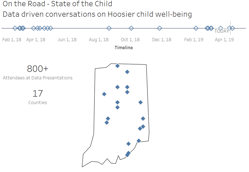
I travel throughout Indiana in my current role and visit rural and urban counties. Our data team facilitates data driven conversations where we look at child trend in Indiana, present local data, challenges, and solutions. The audience is broad and includes legislators, policy-makers, community leaders, and youth serving professionals. My purpose is to create a simple dashboard that demonstrates the various presentations I have engaged in with information on the number of attendees.
I really enjoyed this challenge and was inspired and guided by Ryan Sleeper’s blog.
Some of my learning in this challenge included: creating a timeline, adding a reference line to indicate the current date, creating a custom map (using x/y coordinates), and learning about additional map layouts (with MapBox).
I created two versions for the dashboard and decided on the design below. I like that it has a clean look, it’s very easy to see and understand the major takeaways. Interact here on Tableau Public.
During the creation I learned that creating a MapBox account allows you to have access to additional map templates. I really enjoyed seeing the map designs and liked the ‘MapBox Comic’ design. Version 2, below, shows what this dashboard could have looked like. I ultimately decided against this design because it has a lot going on and felt it might distract viewers.