Throughout the past few weeks I have been diving deep into Tableau, learning, and experimenting with storytelling. I was excited to see the challenge by Data for a Cause and my goal was to create a dashboard that would empower leaders to make data-driven decisions to improve social outcomes.
Not-for-profit organizations can submit a request to have a dataset(s) visualized, this is facilitated by Data for a Cause and is led by Olga Tsubiks. Participants are given 2 weeks to submit data visualizations and the not-for-profit selects 3 winners and uses the visualizations in social media and marketing channels.
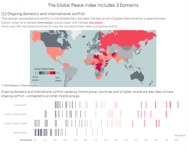
Challenge: The Institute for Economics and Peace has developed metrics to understand peace and ranks 163 countries on 23 indicators. The challenge was to analyze the trends of the least and most peaceful countries, sorted by economic class, and visualize the peace inequality.
Research: My first step in engaging with this challenge was to do research by reading the Global Peace Index 2019, the briefing provides a synopsis of the report and is a good introduction to this topic. I also skimmed through the full report (107 pages) and kept returning to this document as a reference — as I was doing an analysis and choosing what angle to focus on. The Institute for Economics and Peace also had a live stream where they looked at the findings and had a panel discussion on the topics in the report. I took notes as I watched this and found myself returning to the full report to gain a clearer picture of the subjects discussed.
Research Findings: I learned more about the Peace Gap, our world is considerably less peaceful now than it was in 2008 – since the deterioration in peacefulness (11.8%) is larger than improvements in peace (1.7%). I also found the focus for a story by analyzing the three domains that make up the Global Peace Index (GPI). The Tableau visualization I built provides (1) an overview of changes in the GPI. (2) Data on the GPI over the past decade, allowing a user to filter individual countries. (3) An analysis of the 3 domains that make up the GPI. Each of the domains includes context, a map with data on the indicators, and a breakdown by socioeconomic status.
Design: I have been reading Andy Kriebel and Eva Murray’s book #Makeover Monday and have been fascinated by all of their topics on data analysis and visualization. Design is one of the various topics that is discussed in the book and after reading Chapter 6: Designing for an Audience I had the perfect opportunity to try the exercise recommended by Andy and Eva. This exercise focuses on designing a dashboard, it is covered in detail in their book. This post will be a synopsis of my major takeaways.
Building Blocks:
- Charts/Graphs
- First, I spent time going through the data set and building charts/graphs – building and re-building – looking for trends and patterns. This building phase provides insights on the focus of the story.
- Introduction or Subtitle
- The research findings provide context to develop an introduction and subtitles.
- Header or title
- I wrote out a few different titles and recorded these examples.
- Sections of the Analysis
- The research findings provide the context to explain the domains, and my analysis of the data provides details on what is interesting.
- Explanatory text or annotations
Design Activity: After assembling the building blocks above, I sketched these components on sticky notes. For example: a sticky note for a title, sticky note for graph, etc.
- Sketch a 3×4 grid on a piece of paper
- Transfer the sticky notes to the grid
- Arrange and rearrange each section – most important information should be placed on the upper left
- Draw text/annotations directly on the paper
- Iterate the layout a few times. I kept asking myself ‘Is this viz showing the most important metrics? Have I provided context to these metrics? Who is my audience? What defines good or bad?’
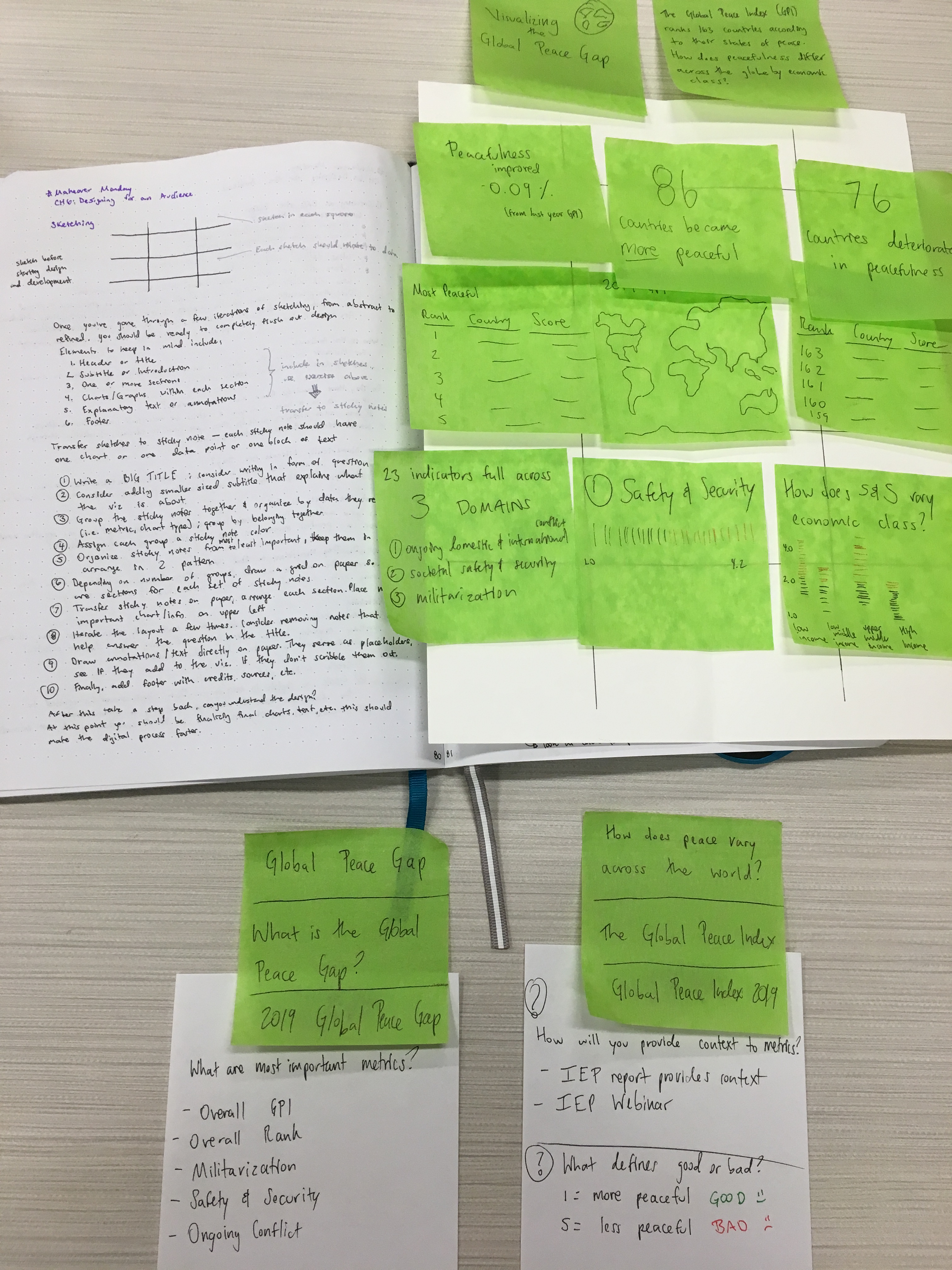
After completing the design activity, I had a much clearer picture of what the dashboard would look like, what points I wanted to emphasize, and really enjoyed this entire process. To view the final dashboard please click here.
I’m also happy to announce that I was selected as a winner of the Data for a Cause challenge! This is super exciting as it’s my first entry and it was a challenging data set. There were participants from around the world and I’m so happy to be a part of a global community that focuses on using their data visualization skills for great causes.