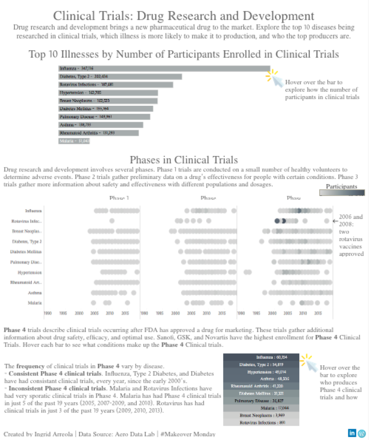
This week my analysis focused on clinical trials for drug research and development, this data is provided by Aero Data Lab and the blog post about this is here. As I read this blog post one of the facts that most stood out is the estimation that only about 1 in 10 drugs that are submitted for clinical testing will be effective. The data provided this week looks at registered clinical trials from 10 large pharmaceutical companies over the past 20 years. The original graph by Spencer Phillips Hey was a graph showing 13,749 trials with more than 6 million patients, it is shown below.

The questions that guide #Makeover Monday are the following:
- What works and what doesn’t work with this
chart?
- The view across time is interesting, because you can see gaps in time as well as times where there’s a lot of clinical trials going on. The shapes are interesting, I wonder what they mean and would like to see a legend perhaps to make this clear from the beginning. This is a very big chart. It takes a little bit to scroll through the entire thing, which is nice if you’re familiar with this field (I am not familiar). As someone who is not familiar it overwhelms me with all the information. Really enjoy the rich detail provided by the author.
- How can you make it better?
- The biggest thing that stuck out to me was the feeling of being overwhelmed –I’d like to explore narrowing down this giant graph into something more manageable. I am not familiar with this industry and some context would be helpful for myself and for others who don’t have the business knowledge.
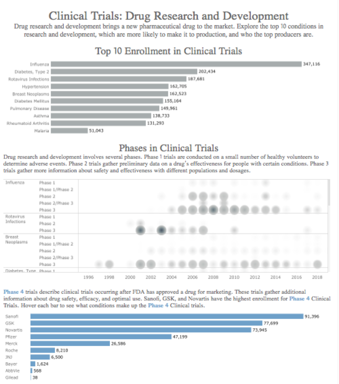
As I began to research this industry, I learned that drug research and development bring new pharmaceutical drugs to the market. Clinical trials are broken down by several phases, and I was interesting in how these phases differ by disease and participant enrollment.
Next, I analyzed the data by focusing on the top enrollment of participant in clinical trials by disease. This is interesting because as a consumer I would feel more comfortable with a product knowing that more people have been tested. Aside from my own bias, the FDA also encourages more participation and diversity in clinical trials (read here). As I began to create visualizations, I began to think about the following:

The clinical phases were most interesting to me because it helped me understand the development of a drug. Phase 1 is conducted on a small number of healthy volunteers to determine adverse events. Next Phase 2 gathers data on a drug’s effectiveness for people with specific conditions. Phase 3 looks at more information concerning a drug’s safety and effectiveness with varying dosage and different populations. Finally Phase 4 describes clinical trials occurring after the FDA has approved a drug for marketing. These trials gather even more detail about safety, efficacy, and optimal use. Learning this context helped me understand the data more clearly, as such I chose to focus the story on this cycle of development. Below is the first version of the visualization.
I received feedback on this visualization by the fabulous Eva Murray and made a few changes to the visualization including:
- The chart at the top was wide. The title for this chart can also be clarified to provide additional context.
- Really interesting suggestion to focus on how phases differ by disease and to compare studies by illness (i.e. how recent were clinical trials by disease).
- Tip: remove the control button ( ‘exclude’ ‘keep only’ etc.)
- Tip: keep color consistent (the blue does appear a bit abruptly)
- Tip: the dashboard actions threw off Eva — and myself too once I interacted more with this dashboard. I removed that action.
The visualization was iterated and can be seen here.